One of the fun things about creating new editions is learning more about the printing process, now just what is possible but how different designs print. There’s often a variation in appearance between the digital image and the final printed product, and I enjoy the challenge of figuring out why – then fixing it.
The new covers for the Champions of St. Euphemia special editions are a good example. They are gorgeous covers, created by Dar Albert. Here are all five of them, plus the new Reader Companion cover:


When the first copies of the books arrived, I thought they looked a bit dark. This would be because there’s very high ink coverage on this image (the colours are saturated) and the ink would expand slightly on the paper used for the cover. I chose a matte stock which is velvety but slightly more absorbent than a coated glossy paper. Each bit of ink spreads a little bit, and when there’s a lot of ink coverage, the image ends up looking darker. This is called dot gain.
I sent a set of books to Dar to see what she thought and she agreed. She adjusted the files, I uploaded them again, and ordered a new set of books. They arrived yesterday, so I photographed them outside in the shade. The original version is on the left and the updated cover on the right.

I mostly see the difference in the type, but they are brighter overall.

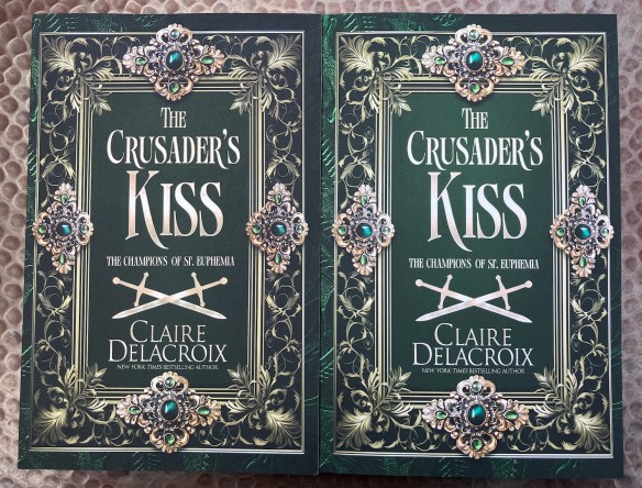
The difference also seems greater to me in the two green covers.

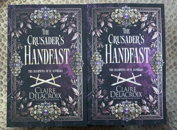
These are the trade paperbacks but the dust jackets on the hard covers are printed on the same paper.
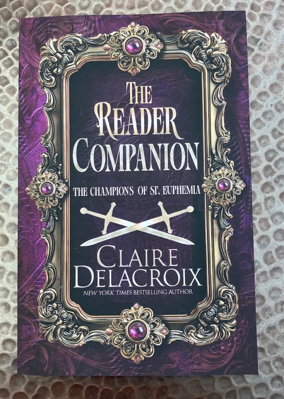
Also, my proof copy of the new Reader Companion arrived. It’s the same trim size as the books, so it’s not that thick, but it looks great. I like the big gem on the back. 🙂

These books were available in my July Kickstarter campaign, which is open for late pledges through August 7. Visit the campaign here.
After that, you can order the books from my online store, right here, for delivery after February 2026. Shop the Champions at Hazel & Honeysuckle Press here.